Blog Published November 24, 2020 · 5 minute read
A Look Back: What Happened in the Outer-Ring Suburbs?
In the run-up to an election, every political prognosticator has an argument for where the election will be decided, and among which voters. Those who work with political data have a sheen of objectivity; we put our data on a pedestal, above observation and opinion. Particularly as parties have honed and refined their campaign data over the years, it can come to seem infallible.
But sometimes, that data does not bear itself out. As Democrats comb through their down-ballot losses and try to understand why what was meant to be a Democratic wave election turned out to be a year of mixed results, one thing is certain: our data was far from infallible.
Over the summer, I published a report that integrated county-level data from the Democratic data firm Catalist about where Democrats could expect to make their biggest gains this year. Third Way accurately predicted that this year, as in 2018, the suburbs would be key to Democratic victories. Not all suburbs are the same, however, and I wanted to know which suburbs were really the key.
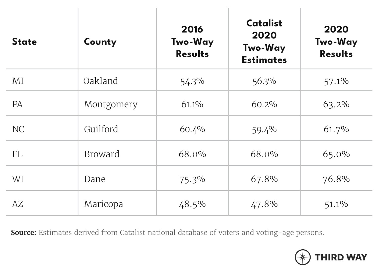
Most people in politics are familiar with the big, suburban collar counties surrounding the swing states’ big cities: Montgomery (PA), Oakland (MI), Broward (FL), Guilford (NC), Maricopa (AZ), Dane (WI). But our data suggested that Democrats had maxed out in these areas. In five out of six of these large suburban counties, it appeared that Democrats would not increase their percentage of the vote from 2016 to 2020. In Oakland County, outside of Detroit, Democrats were expected to make a slight improvement of about two percentage points.
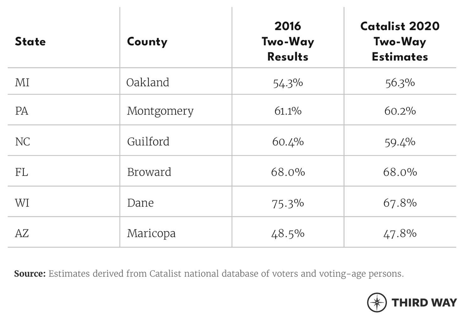
That did not mean that Democrats would not still make gains in turnout or due to population growth in these booming suburbs, but it did seem to indicate that these were not the sites of a political sea change this year. It appeared that whatever changes were going to happen in the biggest suburbs had already occurred over the past few election cycles.
Instead, Democrats appeared poised to make their biggest gains in smaller, outer-ring, often Republican-leaning suburban counties that were each expected to make up between 1.5–4% of a state’s vote share. For contrast, Oakland County was expected to make up 14% of Michigan’s vote share, and Montgomery 7% of Pennsylvania’s vote share. These trends were difficult to measure in Wisconsin or Arizona because of differences in those states’ suburbs, but across Michigan, Pennsylvania, Florida and North Carolina, I identified thirty small suburban counties where Democrats were estimated to improve their support by more than their overall estimated improvement in that state. In Pennsylvania, Florida and North Carolina, those small counties together were expected to net more added votes for Democrats than that state’s biggest suburban county.
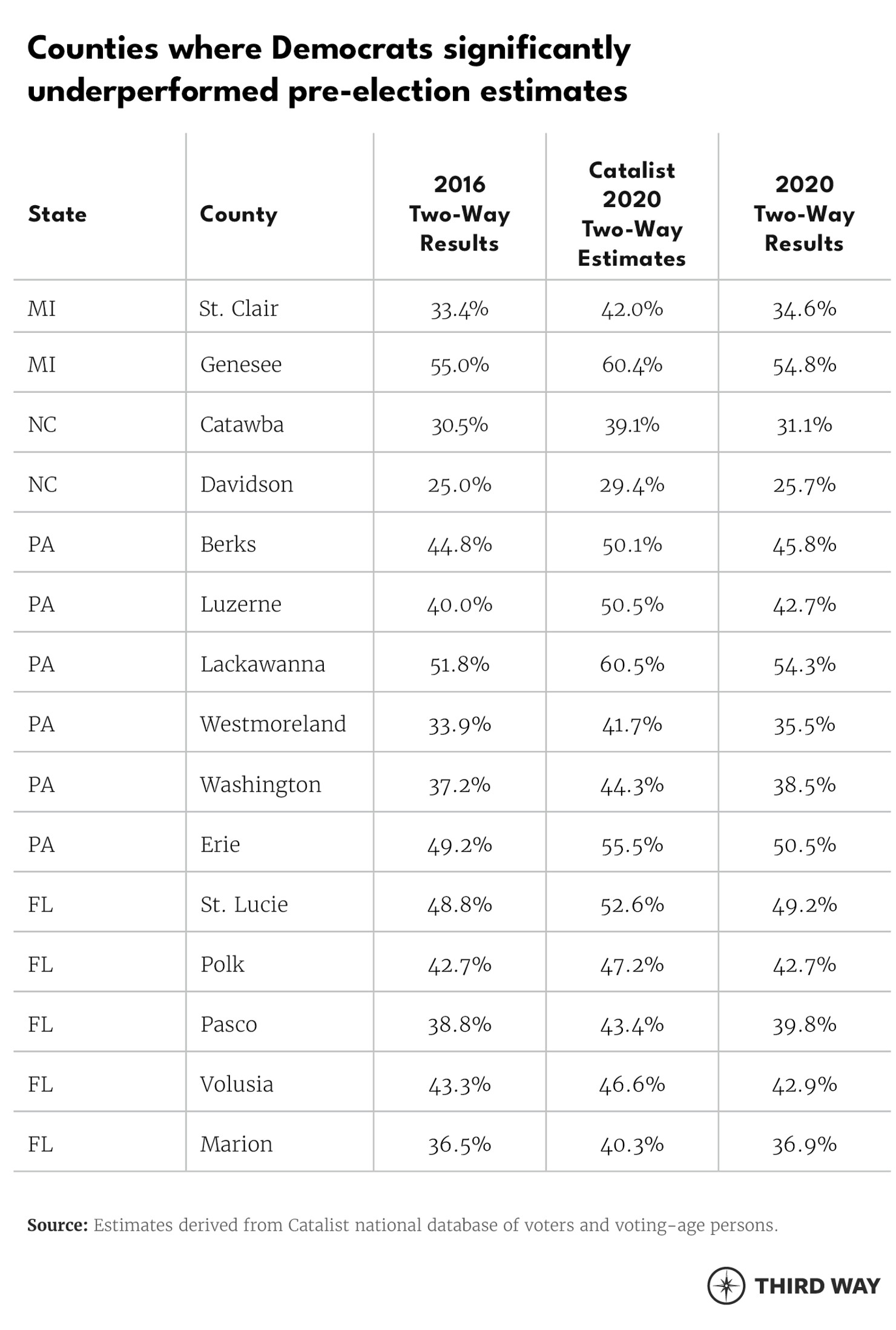
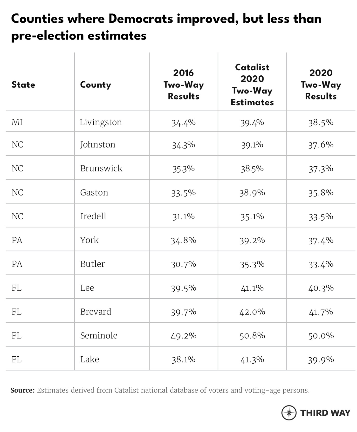
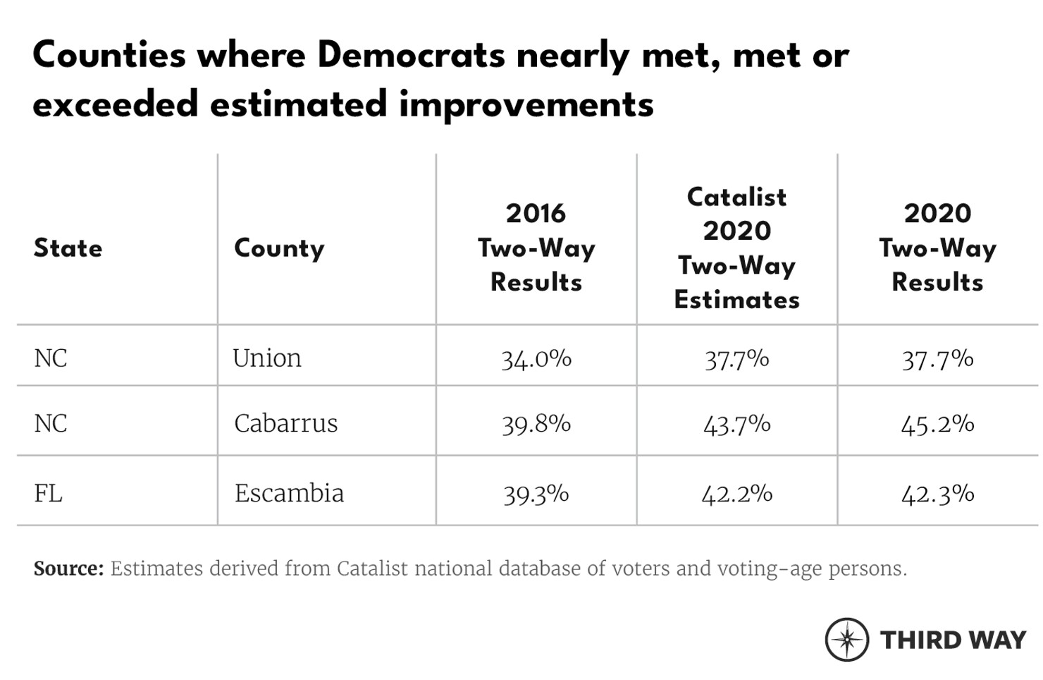
So how did that prediction bear out? Not well. At the presidential level, Democrats made their expected gains in only three out of the 30 small suburban counties. In 15 of the 30, Democrats barely made any gains at all, landing much closer to their 2016 results than to our estimates. The remaining 12 counties were somewhere in between; Democrats made some gains, but they did not reach their expected improvements. Figure 2 lays out the three small suburban counties where Democrats did meet their estimated improvements and the 27 counties where Democrats underperformed their expectations.
And in the big collar suburban counties? Democrats gained three percentage points in Oakland, two in Montgomery, three in Maricopa, and 1.4 in both Guilford and Dane. Only in Broward did Democrats actually underperform. Because these suburban counties are huge, overperforming expectations by even one or two percentage points means many, many more votes in the Democratic column. And that’s without even factoring in the overwhelming turnout in these areas that delivered Democrats far more votes than in 2016.
What does all of this mean, and why does it matter? After all, the suburbs DID play a key role in handing Democrats their victory, as expected.
What this ultimately means is that while we thought blue suburbs could not get any bluer, they did. Big, collar suburban counties can be categorized like cities in that they are core, reliable parts of the Democratic base.
Meanwhile, Democrats did not make their expected gains in smaller, outer-ring suburban counties that typically favor Republicans. It had seemed that perhaps because of Hillary Clinton’s drawbacks as a candidate or failure to campaign outside of metro areas, that this year we would see some reversion to the mean and these red areas might creep back towards Democrats, even if Democrats could not expect to win them outright. But instead, smaller, redder, outer-ring suburbs barely budged.
When we talk about the suburbs for years to come, we will need to remember the intense polarization between the big collar suburbs and the smaller outer-ring suburbs. While they all fall under the same basic category, they are on different sides of the “red America, blue America” divide. The suburbs did help deliver Democrats the White House, but the red areas where Democrats expected to make large gains remained disappointingly out of reach.
